
How I Redesigned Status Chips to Address Users Frustrations and Improve Navigation Clarity
Ever felt lost trying to decipher unclear status labels? That was the experience for former students and Community Managers navigating Miles in the Sky across two platforms. Inconsistent status chips — meant to track course progress and event statuses — caused confusion and frustration due to mismatched designs, conflicting names, and unclear meanings. Recognizing the need for change, I dove into extensive research, gathered user feedback, and collaborated with the team to redesign these chips. The result? A more seamless, intuitive navigation experience that tackled these issues head-on. Keep reading to find out how this redesign transformed the user experience across both platforms and resolved key pain points.
Role
Product Designer
Tools
Figma | Miro | Notion | OBS Software | Hotjar
1. Identifying the Problem
Ever wonder how small design details can create big frustrations? That’s exactly what I uncovered during my deep dive into the Miles in the Sky platforms. The status chips — used to label courses ("Challenges"), modules ("Missions"), and events ("Hackathons") — were loaded with inconsistencies and design flaws. But it wasn’t just my analysis that brought this to light. It was the feedback from former students and Community Managers that truly highlighted the confusion and reinforced the urgency for change.
2. Problems
When clarity fails, frustration rises. The status chips, essential for guiding users across tasks and progress, were causing more confusion than clarity. Two distinct user groups were directly impacted:
-
Former students: employees of client companies who accessed the Learners platform to take courses.
-
Community Managers: the Miles team responsible for managing courses on both the Tower (admin-facing) and Learners platforms.
The key issues affecting both groups included:
-
The chips don't have the same names or meanings across all platforms.
-
The chip design isn't consistent across all pages and platforms.
-
The chip design on the Learners platform is often mistaken for a button by users/students.
-
Both groups expressed difficulty understanding the meanings of the chips, especially students.
-
The inconsistency of chip names and designs made the task of managing courses unnecessarily complex for the community managers.
3. Analysis
To address these issues, I mapped the usage and meanings of each chip across two platforms. We have the Tower platform, which is used for internal management, and the Learners platform, which is used by students to take courses.
Based on this analysis, I created a report detailing the behavior of the chips across platforms.
In addition to the inconsistency in chip design, I also found that the nomenclature wasn't uniform across all areas, and the meaning of the chips varied in some cases. For example:
-
On Tower, the chip is called "Complete," while on Learners, it's "CompleteD."
-
On Tower, the chip is called "In Progress", while on Learners, it's "Ongoing."
Another issue relates to the meanings of each chip. For example:
-
There is significant inconsistency in the use of the "Locked" and "Closed" chips.
-
When a mission on Learners is labeled as "Closed", but the same mission on Tower is labeled as "Locked".

Image 1: Example of chip usage in Learners Platform

Image 2: Example of chip usage in Tower Platform
4. Proposed Update for Names and Meanings
After reviewing everything that had been implemented, I created a table with a proposed nomenclature and meanings for the chips across platforms. I presented this in a meeting with the other Product Designer, Product Lead, and Learning Coach Lead (who uses the Tower platform daily) [Image 3]. During this meeting, we refined the vision for the platforms together and created the final version of the nomenclatures and meanings [Image 4].

Image 3: First version of the table with a proposed nomenclature and meanings for the chips across platforms

Image 4: Final version of the table with a proposed nomenclature and meanings for the chips across platforms
5. Proposed Design Update
The next step was to create a new design for the chips that would work in all the use cases mapped in Tower and Learners and solve the issues that had been identified.
I researched how chips and status tags are used in other educational platforms and sectors. Some of the references included Notion, Trello, Billage, and Remit. I also used Dribble and Mobbin to find good solutions and identify those that were less effective. After that I created the design for the new chips [Image 5].
I created all the user stories with complete flows in Figma to ensure that all cases were covered. This also allowed us to test the application of the new statuses and eventually submit the designs to developers.

Image 5: Proposal for a New Design for the Chips

Image 6: Application of the New Chip on the Challenge Page

Image 7: Application of the New Chip on the Missions Modal

Image 8: Application of the New Chip on Inside Mission

Image 9: Application of the New Chip on Hackathons cards
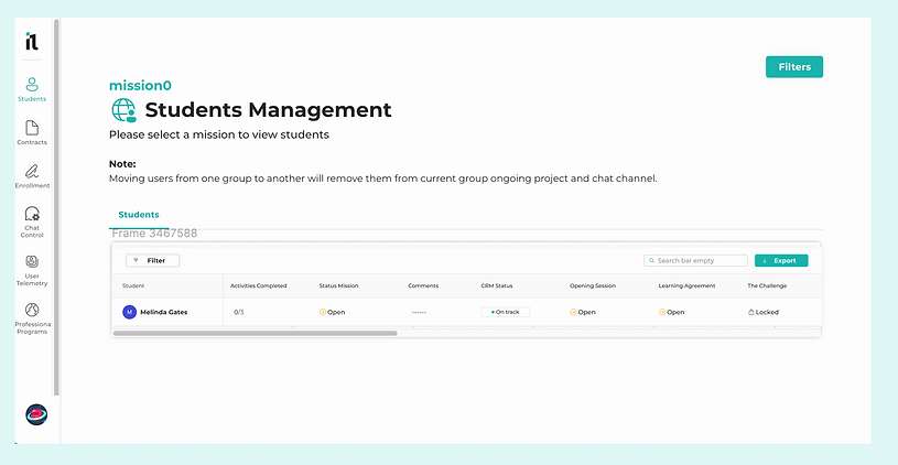

Images 10 and 11: Applications of the New Chip on Tower
6. User Testing
I organized, wrote, and created a round of user testing to evaluate the new chips with real users.
I developed the script for the tests and created prototypes to be tested. In May of this year, I conducted the user testing with four potential future students of the Miles platform.

Images 12: Screenshot of Notion Document of the User Testing Script
7. Report
After the user testing sessions with the four participants, I transcribed the videos (screen capture and voice) of all sessions, analyzed the results, and identified what we could learn from these tests and how we could improve the platform based on the feedback regarding the chips.
Some of the findings were:
-
Users encountered confusion with the disabled "Mark as Complete" button, with some expressing frustration over not understanding why the task could not be marked complete. A tooltip was suggested to clarify why it’s disabled and provide next steps.
-
Differentiating between "Closed" and "Overdue" chips was challenging for some users, who felt that both statuses implied tasks should be inaccessible, leading to suggestions for clearer labeling or functionality distinctions.
-
Positive feedback was given on the platform layout, noted as simple and easy to navigate, although the prototype’s small size caused some difficulty, especially with reading elements like the Navbar.
-
Users appreciated the potential of an "Overdue" chip, suggesting it could motivate task completion even after deadlines.
-
Some users expressed a desire for access to "Closed" tasks for future reference, either for review or study purposes, especially if the task was previously completed.
8. Next Steps
-
Within a "Closed" Mission, we will add a tooltip to the disabled "Mark as Complete" button, explaining why it is disabled and what needs to be done.
-
Investigate whether it's necessary to better distinguish between a Challenge and a Hackathon.
-
The update to the "Next" button within a mission on mobile has now been prioritized as urgent.