Portugal by Step App
It's an app to help non-EU migrants in Portugal.
"Manage by yourself your move to Portugal easily and securely."
-
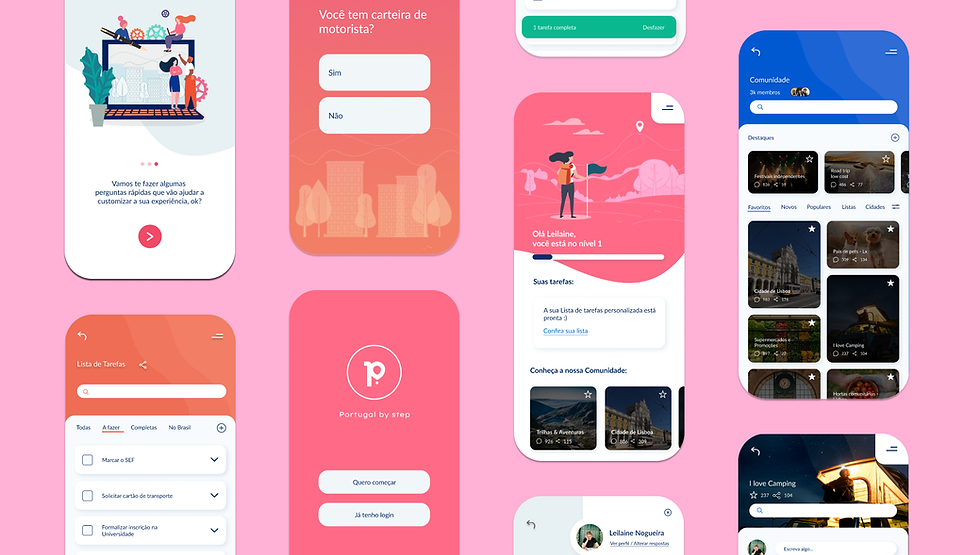
Customized Task List with verified infos and hyperlinks.
-
Online Community with moderation and verified infos.
Role
UX/UI Designer
Mentorship
Ruan Teles (Senior Design System Designer at Revolut) and Antonio Câmara (Chairman at YGroup & Professor at Universidade Nova de Lisboa)
Awards
Finalist team & Honorable Mention at FCSH-Santander 'Best Business Idea Entrepreneurship Award' - Nov 2019
Tools
Figma | InVision | Adobe XD | Color Hexa | Color Box (by Lyft Design) | Miro | Notion
1. Ideation
The ideation of this project started with the identification of some serious problems faced by migrants in Portugal and I felt the desire to develop an alternative solution for some of them. At this stage, preliminary research and informal conversations were carried out with migrants: Brazilians, Ukrainians, Mexicans, and Chinese with different types of visas. This research showed that it was indeed possible to identify real collective pain points, but it was still necessary to explore more and to segment the target of the first solution to be built.
2. Analysis of potential competitors
Some indirect competitors were identified. Competitors who delivered the entire solution, parts of the solutions or alternatives to the solution I was working on were sought. I was mainly aware of the benchmark performance to identify the gap & the best performers and Improve performance often by learning from others.
Therefore, during my analysis I’ve looked for indirect competitors divided into four categories: (1) Sale of online courses; (2) Applications with guides and simulators; (3) Legal consultancy; and (4) websites with free content. I’ve concluded that there was room in the market for the “Portugal by Step” solution as an application with “Task List” and “Community” functionalities.
3. Exploratory interviews
The initial target was segmented: Brazilians with higher education student visas and who don’t have European nationality. Thus, hypotheses about pain points and solutions were formulated. After that, exploratory interviews (recorded, authorized and transcribed) were carried out with six potential users. So, it was possible to test hypotheses already created and collect insights for the project. Each interview lasted an average of 25 minutes.
The exploratory interview method was chosen because it could develop cognitive empathy and active listening. And that way, I built interviews with open questions and as similar as possible to a conversation. The “question-story” feature was used to extract more impressions with meaning, emotion and details.
4. Qualitative research
Exploratory interviews offered a lot of information and new paths for solutions. They were listened to, transcribed and analyzed. After that, there was a deepening of the initial research that had already been done of documents, institutional and governmental websites and reports of the Foreigners Service of Portugal.
Afterwards, the “Community” functionality was definitively added to the prototype, with three main objectives: (1) Creation of a support network for migrants; (2) Search and debate on topics of interest; (3) Possibility to share custom task lists.
5. User journey
A User Journey map was built on the web-software called “Miro”. This map continued to be updated throughout the entire process. One of the challenges of the journey was the decision regarding the sign-up and the base questions.
I’ve followed the advice of Echessa (2014), and other designers, and left the registration stage as far away as possible. “You should not require your user to be logged in before they are able to use your app and see what it offers. (Echessa, 2014)”. At “Portugal by step”, the sign-up data are only requested after the onboarding path and the base questions. The sign-up screen explains the advantages of registering: generating the customized task list and saving it.
With the 3-step onboarding, the goal is to present the main functions to prove the value of the app and the importance of answering the questions in the next step. After that, the base questions step to create the custom list begins. The questions are important because from them I can build a higher experience for the user and this becomes clear on the journey.
6. Wireframe
Some alternative solutions for the design and interaction of the two main functionalities were tested. The wireframe was instrumental in testing design decisions, flow, and information architecture. It was a good opportunity to understand what was fundamental in the prototype for usability tests to be carried out.
At this point, it was already understood that using gamification resources would be a good option to involve users in accomplishing tasks and improving their experience during the journey.
I wanted to promote a sense of achievement of goals that, according to Dr. Hugo Liu, from MIT in his article “Need to Complete”, stimulates the release of large amounts of endorphins by the brain. Therefore, I use progress bars, levels, missions and success boxes.
7. Styleguide
I’ve built the styleguide with the color system and the typography system applied. It is noteworthy that the chosen color palette and typographic scheme were designed to complement each other.
The chosen colors and shades were designed to approximate a complementary double harmony (red, orange, blue and green). In this case changing the red — which within the convention of digital products has other more well-established functions that will be used in this project — for pink. Two complementary color pairs (pink/green and orange/blue) were chosen. In the chromatic circle, this quadruple of colors generates the shape of a chromatic rectangle. In line with this fact, they were selected and grouped considering the material, affective and sensory associations that they generally provoke on people, according to the psychodynamics of colors. Pink is used as the main color of the application. It is used in the splash screens, onboarding and homepage. Orange is the “Task List” color and blue is the “Community” color. By unifying the chosen colors with the “Lato” typography, in totality, the application transmits modernity, confidence, energy of change and a friendly and active character.
8. High fidelity prototype
Since I invested a lot of time in building the wireframe and styleguide, the high-fidelity prototype didn't have any structural changes. The style of the application's design elements was inspired by “Material Design” developed by Google.
All elements use the same principles so that they are consistent, convey clarity and present a strong, clean unity. Aiming to incorporate dynamic characteristics, the designs were built to have more rounded corners so that they convey a sense of fluidity. This choice makes the overall design look friendlier. A good example of this are the cards and overlays used in the application.
Accordingly, the design choices were inspired by the physical world and its textures, including how they reflect light and cast shadows, to create hierarchy, meaning and focus, engaging users in the experience. This can be seen in the graphics used on the main pages of the two functionalities of the application and also in the contrast of colors/shadows of the background of the “Task List”.
9. Usability tests
With usability tests it is possible to get in touch with a new perspective and identify usability issues. I was inspired by Krug's “Do-It-Yourself Usability Tests” using the “think aloud methodology” and other important teachings of Krug, Nielsen and Budiu.
A simple usability test doesn't mean a worse test. This is a qualitative study, so by focusing on following the guidelines properly with few participants it was possible to: (1) identify the biggest usability issues; (2) classify them in priority level and ease of resolution; (3) solve them or point out possible future solutions.
Our usability tests had six participants in total. All of the participants are from the chosen segment. None of these six people had specific knowledge about the project. First, I’ve asked permission to record the audio, video and screen capture of the test. Then, I’ve explained how the test would work and the average duration. In the third stage, participants performed 4 tasks divided into two different scenarios. Targeted tasks were used to test specific features, in this case Scenario 1 was directed to the functionality of the “Task List” and Scenario 2 to the functionality “Community”. Finally, the participants answered a questionnaire to draw the user's profile. Each test lasted an average of 20 minutes.
10. Solving usability issues
Usability tests generated a table organized into 4 columns: (1) problem; (2) severity; (3) priority; and (4) observations. Severity is ordered in: High, Medium, Low and Enhancement. The priority is organized in order of resolution, with #1 being the first problem to be solved and so on in ascending order. Six problems have been identified, three of which have already been resolved. Two issues that weren’t resolved are in the “Enhancement” category, so they were allocated to phase 2.0 of the application. The other unresolved issue requires further usability testing. It has only been identified by one person and doesn’t have high gravity.