
How I Redesigned a Platform to Solve Usability Issues and Drive User and Business Growth
Great design starts with understanding the user. In leading the redesign of the Intuitivo platform, I had the chance to dive deep into the challenges users faced and uncover opportunities for transformation. As the lead UX/UI Designer, I embraced a user-centric approach to not just address existing pain points but also to elevate the platform’s overall usability and appeal. From conducting insightful user research to presenting low-fidelity drafts to the CPO and CTO, every step of the process was driven by a commitment to innovation and collaboration. The result? A redesign that made Intuitivo more intuitive — strengthening its impact on users while driving business growth.
Role
UX/UI Designer Lead
Tools
Figma | Color Hexa | Color Box (by Lyft Design) | Miro | Notion
1. Context
A platform’s first impression can make or break opportunities. For Intuitivo, an outdated interface and usability issues were becoming significant roadblocks. These challenges not only frustrated users but also held back the company’s ability to attract new customers and impress potential investors. The platform needed a fresh look and improved functionality to stay competitive and compelling in a fast-evolving digital landscape.
2. Problems
Every issue tells a story, and understanding those stories is key to crafting impactful solutions. Intuitivo had already collected valuable user feedback, but the challenge lay in transforming these notes into actionable insights. To justify the investment of time and resources, I needed to dive deeper—analyzing each problem to understand its root causes. Through usability tests, I gained a comprehensive view of user pain points, allowing me to assess their severity and prioritize them effectively. This collaborative process with the product development team laid the foundation for targeted, impactful solutions.

Table with the hierarchy of problems
3. Planning
With a clear understanding of the issues at hand, it was time to strategize a roadmap for solving them. I worked with the team to prioritize quick wins—low-priority issues that were simple to address — while developing more robust solutions for the bigger challenges. This structured approach ensured that we could start improving the platform right away while planning for long-term improvements.
4. Execution
The solution phase was all about transforming our ideas into tangible results. I designed a comprehensive Style Guide to unify the platform’s aesthetic, embraced a modern flat design to simplify the interface, and refreshed the branding colors to create a more cohesive visual experience. I also revamped the platform’s information architecture by implementing a vertical menu that was not only more intuitive but also supported the addition of two new key features, improving the overall user experience.
_edited.jpg)
Wireframe sketching
5. The game-changing Challenge
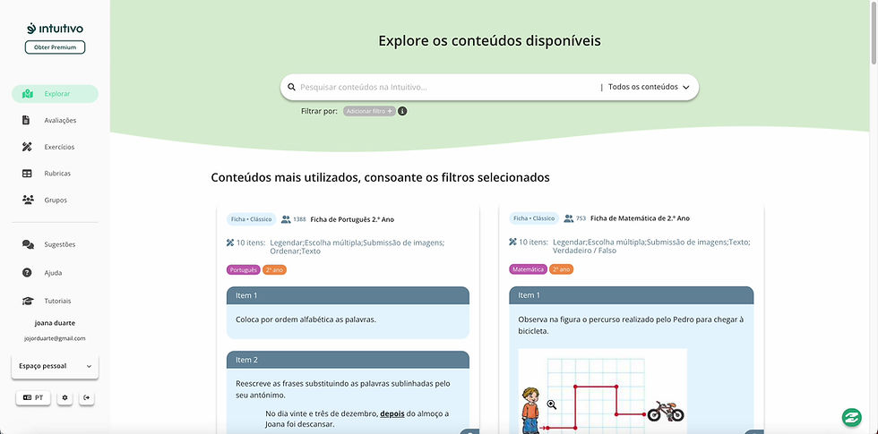
During the redesign, a major discovery emerged: the horizontal menu was frustrating users, making it difficult for them to find key features. To solve this, I redesigned the navigation with a vertical Navbar, streamlining the information architecture. This change made the platform much easier to navigate, ultimately improving accessibility and ensuring users could seamlessly access all the tools the platform had to offer.

Implementation "Explore" feature
Video of the filter implementation in the Explore feature
6. Impacts
-
Intuitivo is making digitization in schools more humane and meaningful
-
35K+ teachers on the platform
-
250K+ work hours saved
-
1M+ assessments performed
-
Implementation of the Intuitivo Ambassadors program with more than 300 participants
-
300% increase in the number of institutions using the platform
-
Became part of Techstars investors